Blockchain Data Visualization: Making Complex Networks Understandable
Explore how modern visualization tools transform raw blockchain data into actionable insights through effective data presentation methods, interactive dashboards, and analytical interfaces.

The blockchain ecosystem generates vast amounts of data every second—transactions, smart contract executions, token transfers, and network state changes. For developers, analysts, and everyday users, making sense of this information requires sophisticated visualization tools that transform raw data into clear, actionable insights. Modern blockchain explorers have evolved far beyond simple transaction lists, offering interactive dashboards and analytical interfaces that bring clarity to complex network activity.
The Challenge of Blockchain Data Complexity
Blockchain networks operate as distributed systems where thousands of nodes process transactions simultaneously. Each block contains multiple transactions, each transaction may interact with several smart contracts, and each smart contract can trigger cascading effects across the network. This interconnected web of activity creates a data complexity challenge that traditional tabular displays struggle to address effectively.
Raw blockchain data presents several visualization challenges. Transaction hashes appear as long hexadecimal strings that provide no immediate context. Gas fees fluctuate based on network congestion patterns that aren't immediately visible. Smart contract interactions create dependency chains that span multiple blocks and addresses. Without proper visualization, users face cognitive overload when trying to understand network behavior or trace specific transaction paths.
Key Visualization Principles
- Progressive Disclosure:Present high-level summaries first, allowing users to drill down into detailed data as needed
- Contextual Information:Provide relevant metadata and explanations alongside raw data values
- Visual Hierarchy:Use size, color, and position to indicate importance and relationships
- Real-Time Updates:Reflect network changes immediately to maintain data accuracy
- Interactive Exploration:Enable filtering, sorting, and custom views for personalized analysis
Transaction Flow Visualization
One of the most powerful visualization techniques for blockchain data involves mapping transaction flows as network graphs. Instead of displaying transactions as isolated entries in a list, flow visualizations show how value moves between addresses over time. Nodes represent wallet addresses or smart contracts, while edges represent transactions, with thickness indicating transaction volume and color representing transaction type or status.

Advanced transaction flow visualizations incorporate temporal dimensions, allowing users to watch how transaction patterns evolve over hours, days, or weeks. Animation techniques can show value propagation through the network, making it easier to identify patterns like token distribution events, exchange deposit flows, or suspicious activity clusters. Interactive controls let users pause, rewind, or speed up the visualization to focus on specific time periods of interest.
For Sol Scan and similar blockchain explorers, transaction flow visualization helps users understand complex multi-hop transactions where tokens pass through several intermediary addresses before reaching their final destination. This capability proves invaluable for tracking token origins, identifying liquidity pools, and analyzing decentralized exchange routing paths.
Interactive Dashboard Design
Modern blockchain explorers organize information through interactive dashboards that present multiple data dimensions simultaneously. Effective dashboard design balances information density with clarity, using card-based layouts to group related metrics while maintaining visual breathing room. Each dashboard component serves a specific analytical purpose, from real-time network statistics to historical trend analysis.
Key dashboard components include network health indicators showing block production rates, transaction throughput, and validator performance. Price and market data widgets display token values, trading volumes, and market capitalization trends. Activity feeds highlight recent transactions, new smart contract deployments, and significant network events. Gas fee trackers help users optimize transaction timing by showing current network congestion levels and fee predictions.
Dashboard Customization Features
Effective blockchain dashboards offer personalization options that let users configure their analytical workspace:
Choose which data components appear on your dashboard
Arrange and resize widgets to match your workflow
Set custom notifications for specific network events
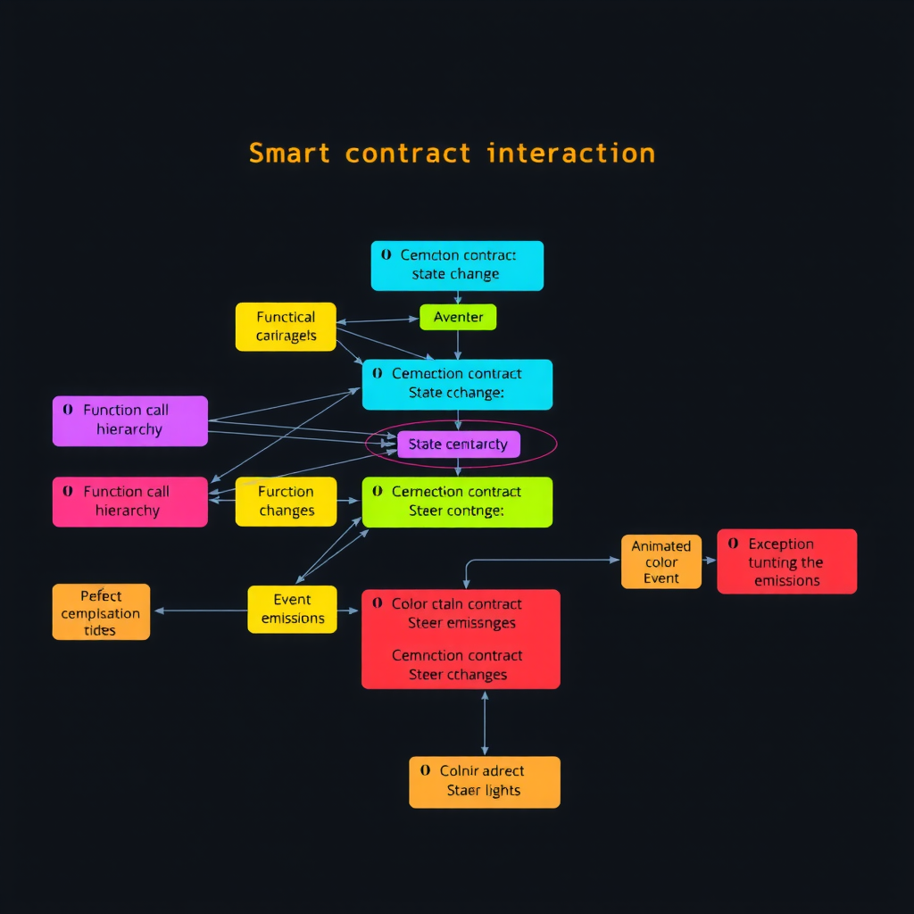
Smart Contract Interaction Visualization
Smart contracts represent some of the most complex elements in blockchain ecosystems, with intricate internal logic and external dependencies. Visualizing smart contract interactions requires specialized approaches that reveal function calls, state changes, and event emissions in understandable formats. Call graphs show how contracts invoke each other, creating dependency trees that help developers understand system architecture and identify potential vulnerabilities.
State change visualizations track how contract variables evolve over time, displaying storage slot modifications as timeline graphs or diff views. This approach helps auditors verify contract behavior and users understand how their interactions affect contract state. Event logs receive visual treatment through filterable timelines that group related events and highlight significant state transitions.
For decentralized finance protocols, contract interaction visualization becomes particularly valuable. Users can see how their transactions flow through multiple protocol layers—from initial token approval through swap execution to liquidity pool updates. This transparency builds trust and helps users understand the true cost and complexity of their DeFi operations.
Network Statistics and Trend Analysis
Blockchain networks generate continuous streams of statistical data that reveal network health, adoption trends, and usage patterns. Effective visualization of these statistics requires careful selection of chart types and time scales. Line charts excel at showing trends over time, such as daily transaction counts or average block times. Bar charts effectively compare discrete categories, like transaction types or top token holders. Heat maps reveal patterns in two-dimensional data, such as transaction activity by hour and day of week.
Advanced statistical visualizations incorporate multiple data dimensions through techniques like small multiples, where several related charts appear side by side for easy comparison. Sparklines provide compact trend indicators within table cells, showing historical patterns without requiring full chart space. Distribution charts reveal data spread and outliers, helping identify unusual network behavior or potential anomalies.
"The goal of blockchain data visualization isn't just to display information—it's to reveal insights that would remain hidden in raw data. Every chart, graph, and interactive element should answer a specific question or support a particular analytical task."
Real-Time Data Streaming and Updates
Blockchain networks operate continuously, with new blocks and transactions arriving every few seconds. Effective visualization tools must handle this constant data stream without overwhelming users or degrading performance. Real-time updates require careful balance between immediacy and stability—showing new data quickly while maintaining visual continuity that prevents disorienting jumps or flickers.
Modern blockchain explorers implement several strategies for real-time visualization. Incremental updates add new data points to existing charts without redrawing entire visualizations. Smooth transitions animate changes rather than applying them instantly, helping users track what's new. Aggregation techniques group rapid updates into periodic batches, reducing update frequency while maintaining data accuracy. Priority systems ensure critical updates appear immediately while less urgent changes queue for the next update cycle.
WebSocket connections enable efficient real-time data delivery from blockchain nodes to visualization interfaces. These persistent connections push new data as it becomes available, eliminating the latency and overhead of repeated polling requests. Client-side caching and data management ensure smooth performance even during periods of high network activity when transaction rates spike.
Mobile-Responsive Visualization Design
As blockchain adoption grows, users increasingly access network data through mobile devices. Responsive visualization design adapts complex data displays to smaller screens without sacrificing functionality or clarity. This adaptation requires thoughtful decisions about information hierarchy, interaction patterns, and visual density.
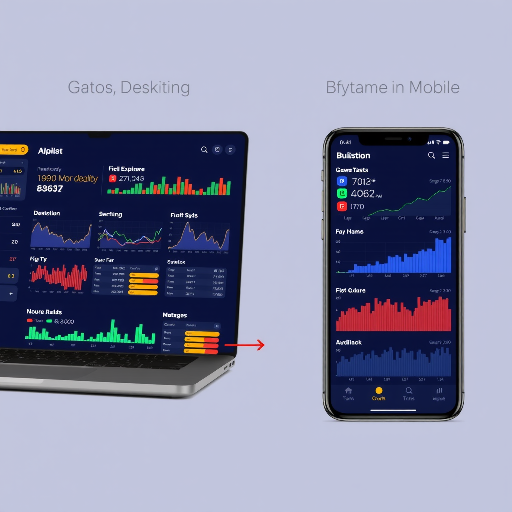
Mobile-optimized visualizations prioritize essential information, using progressive disclosure to hide secondary details behind expandable sections. Touch-friendly controls replace hover interactions, with larger tap targets and gesture support for zooming and panning. Simplified chart types work better on small screens—vertical bar charts instead of complex scatter plots, single-metric cards instead of dense data tables. Responsive layouts stack dashboard widgets vertically on mobile while maintaining multi-column arrangements on larger screens.
Accessibility in Data Visualization
Effective blockchain data visualization must serve all users, including those with visual impairments or other accessibility needs. Color-blind friendly palettes ensure that chart distinctions remain clear regardless of color perception. High contrast ratios between text and backgrounds improve readability in various lighting conditions. Alternative text descriptions provide context for screen reader users who cannot see visual charts.
Keyboard navigation support allows users to explore interactive visualizations without a mouse. Focus indicators clearly show which element currently has keyboard focus. Data tables provide sortable columns and filterable rows that work with assistive technologies. Semantic HTML structure helps screen readers understand content hierarchy and relationships.
Accessibility Best Practices
- Use color plus additional visual indicators (patterns, shapes, labels) to convey information
- Provide text alternatives for all visual data representations
- Ensure interactive elements have clear focus states and keyboard shortcuts
- Maintain minimum contrast ratios of 4.5:1 for normal text and 3:1 for large text
- Support screen reader announcements for dynamic content updates
- Test visualizations with actual assistive technologies and diverse user groups
Performance Optimization for Large Datasets
Blockchain networks accumulate enormous amounts of historical data—millions of transactions, thousands of blocks, and countless state changes. Visualizing this data efficiently requires sophisticated performance optimization techniques. Data aggregation reduces granularity for historical periods, showing daily summaries instead of individual transactions when viewing long time ranges. Pagination and virtual scrolling load only visible data, deferring off-screen content until users scroll to it.
Client-side caching stores frequently accessed data locally, reducing server requests and improving response times. Lazy loading defers non-critical visualization components until they enter the viewport. Web workers offload heavy computational tasks to background threads, preventing UI freezes during complex data processing. Canvas-based rendering handles large datasets more efficiently than DOM-based approaches, especially for scatter plots or network graphs with thousands of data points.
Server-side preprocessing prepares aggregated data views in advance, so clients receive pre-calculated statistics rather than raw transaction data. Compression techniques reduce data transfer sizes, particularly important for mobile users on limited bandwidth connections. Progressive loading displays low-resolution previews immediately while high-detail data loads in the background.
The Future of Blockchain Data Visualization
As blockchain technology evolves, visualization tools must adapt to new challenges and opportunities. Cross-chain visualization will become increasingly important as users interact with multiple blockchain networks simultaneously. Unified dashboards that aggregate data from different chains will help users understand their complete blockchain footprint. Standardized visualization protocols may emerge, allowing consistent data presentation across different blockchain explorers and analytical tools.
Artificial intelligence and machine learning will enhance visualization capabilities by identifying patterns, predicting trends, and highlighting anomalies automatically. Natural language interfaces may allow users to query blockchain data conversationally, with visualization tools generating appropriate charts and graphs based on spoken or typed questions. Augmented reality could bring blockchain data into physical spaces, overlaying network statistics onto real-world environments.
Privacy-preserving visualization techniques will balance transparency with confidentiality, showing aggregate patterns without exposing individual transaction details. Zero-knowledge proofs may enable verified data visualization where users can confirm statistical accuracy without accessing underlying raw data. Decentralized visualization infrastructure could distribute rendering workload across network participants, creating resilient analytical tools that don't depend on centralized servers.
Transform Complex Data Into Clear Insights
Modern blockchain visualization tools make network complexity understandable, turning raw transaction data into actionable intelligence for developers, analysts, and users.
Conclusion
Blockchain data visualization represents a critical bridge between complex network operations and human understanding. By transforming raw transaction data, smart contract interactions, and network statistics into clear visual representations, modern blockchain explorers empower users to make informed decisions, identify patterns, and understand network behavior at a glance.
Effective visualization combines multiple techniques—interactive dashboards, real-time updates, responsive design, and accessibility features—to create comprehensive analytical tools. As blockchain networks grow more complex and interconnected, visualization tools will continue evolving, incorporating new technologies and methodologies to maintain clarity and insight.
For platforms like Sol Scan and other blockchain explorers, investing in sophisticated visualization capabilities isn't just about aesthetics—it's about making blockchain technology accessible, understandable, and actionable for everyone from casual users to professional analysts. The future of blockchain adoption depends partly on our ability to present its complexity in ways that humans can readily comprehend and confidently navigate.